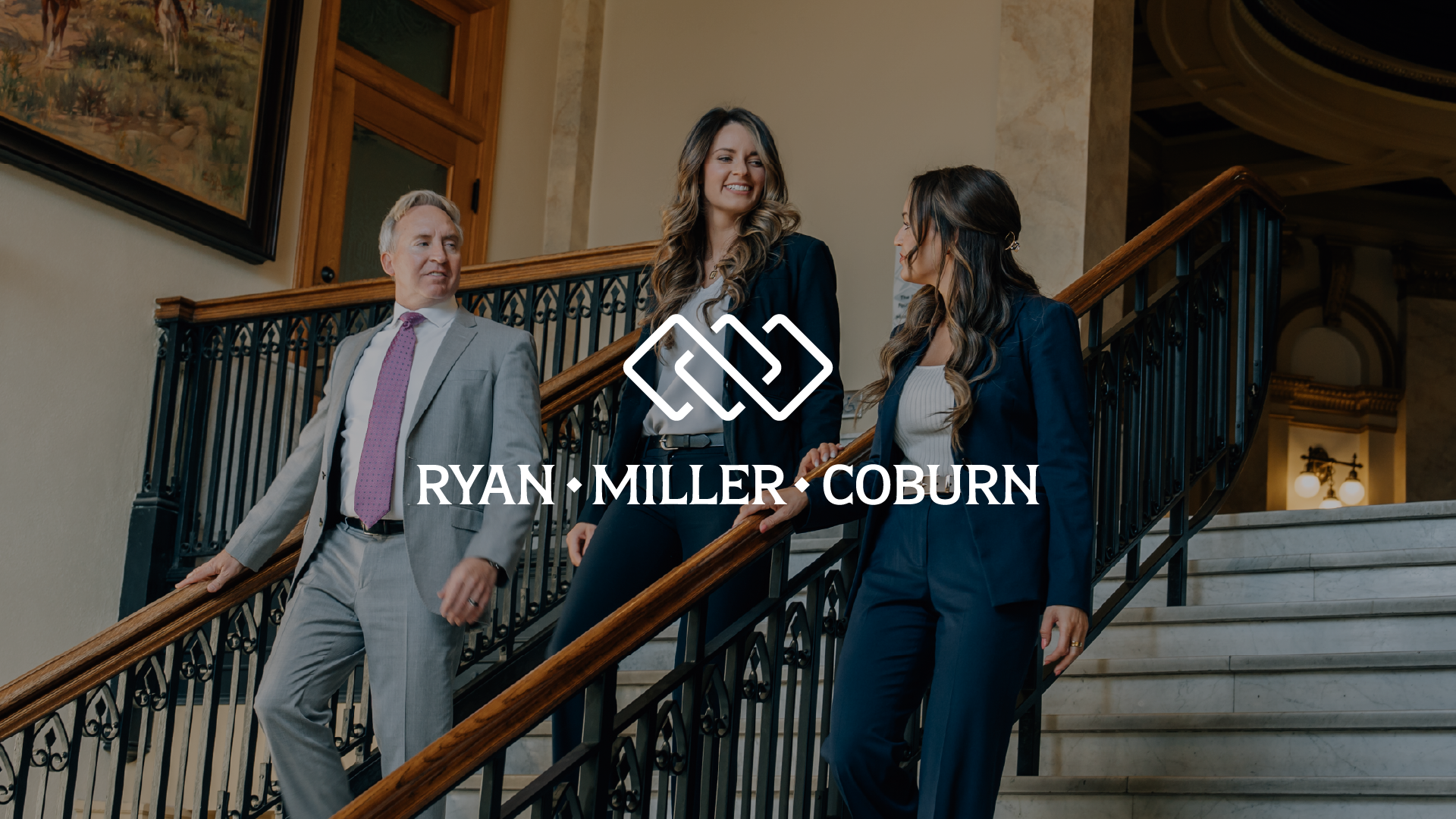
Ryan, Miller & Coburn
Rebrand + Website + Commercial
Overview
Ryan, Miller & Coburn is a Montana law firm specializing in personal injury, criminal defense, medical malpractice, and DUI cases. When they added Abigail Coburn as a partner, they needed a brand refresh that reflected the firm's growth while maintaining the approachable, professional tone that sets them apart.
We had created their original brand, so we understood what worked and what needed to evolve.
We had created their original brand, so we understood what worked and what needed to evolve.
The Challenge
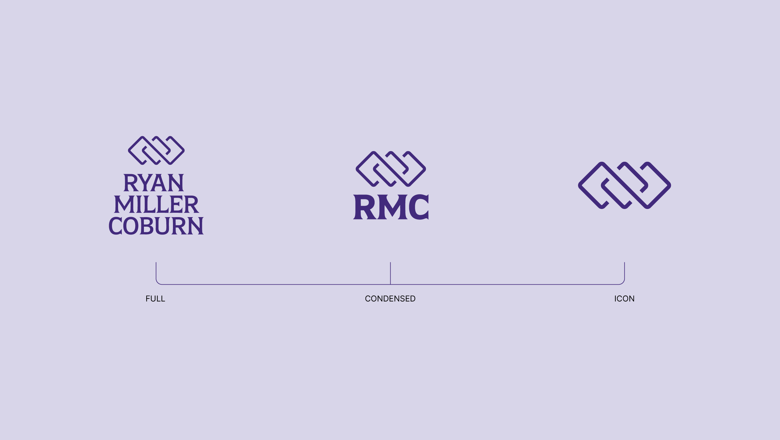
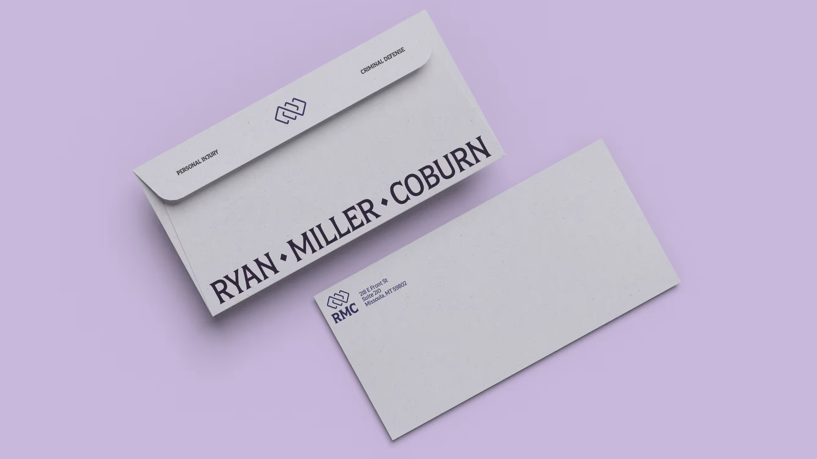
Adding a third partner meant the brand needed to grow without losing continuity. The firm wanted to keep purple as their primary color and retain the diamond motif (a symbol of premium service and connection) but nearly everything else needed to shift.
The refresh needed to carry across three major deliverables: a new brand identity, a redesigned website, and a video campaign. Each had its own function, but they all needed to feel like they came from the same place.
The refresh needed to carry across three major deliverables: a new brand identity, a redesigned website, and a video campaign. Each had its own function, but they all needed to feel like they came from the same place.

Our Approach
Brand Identity
We started here because it informed everything downstream. New brandmark, new typeface, refined color palette. Built around the diamond and purple, but refreshed to align with where the firm was headed. The diamond motif stayed as a signal of premium service and connection, but the execution needed to feel current.
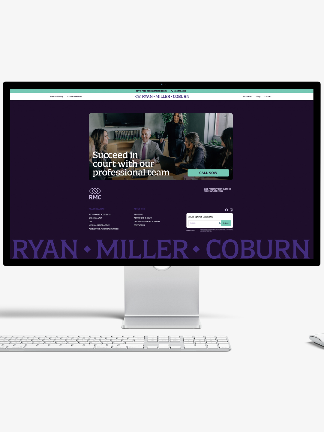
Website
Once the brand was locked, we designed a new site focused on clarity and usability. The goal was to create a clean, modern experience that matched the quality of the firm's service. We built intuitive navigation with clear information hierarchy, simplified the visual design, and made it easy for people to find what they needed.
Video
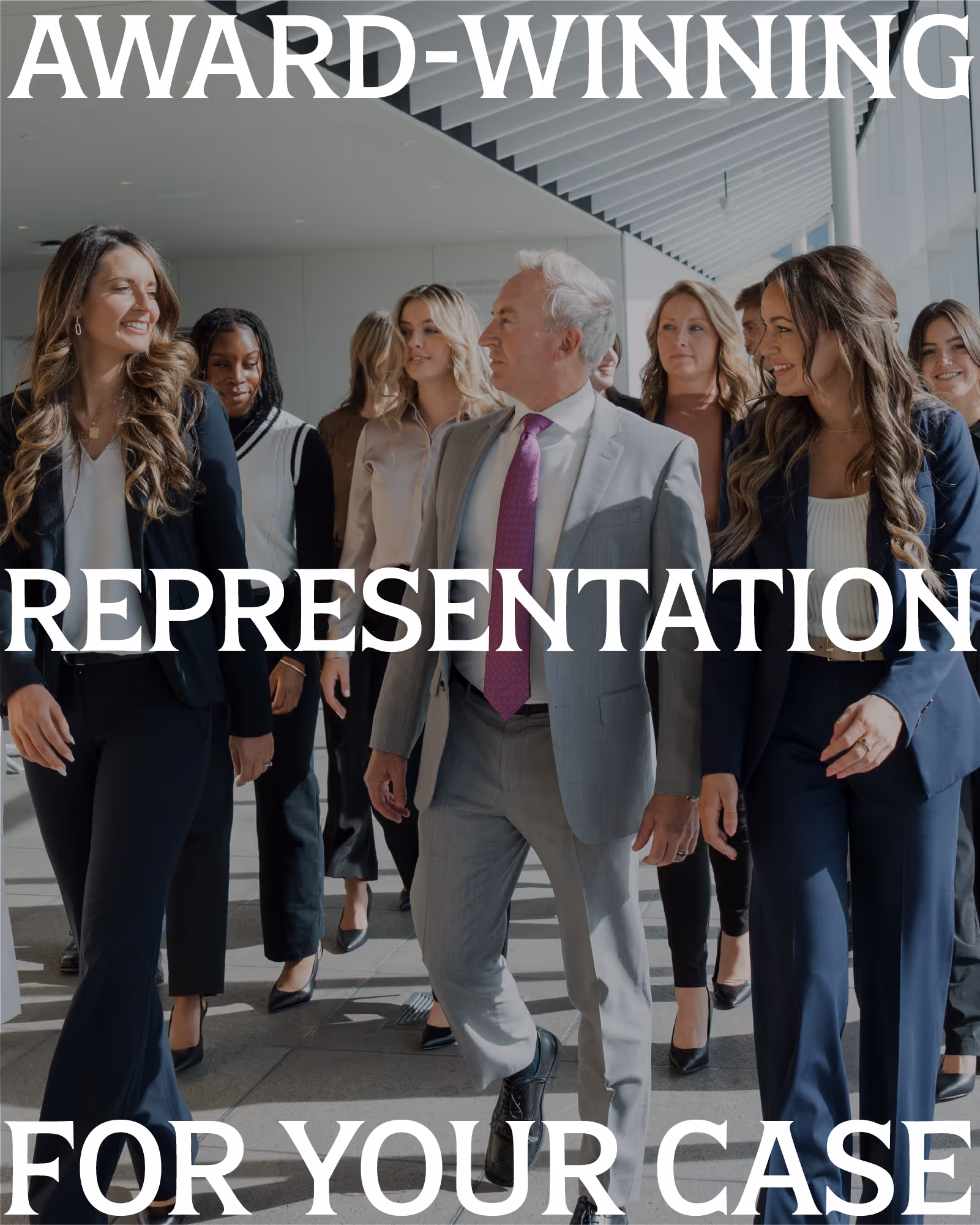
The final piece was a 30-second commercial designed to launch alongside the rebrand. The script positioned the firm as local advocates; neighbors who travel across Montana to stand by their clients. We filmed in Missoula to tie the message to place. The ad was made for web, social, and broadcast.


Special Thanks
Thanks to Angie Miller, Paul Ryan, Abigail Coburn, and Cara Ollmann for a great collaborative and trusting relationship.
Thanks to Whitney and Cody Root for their appearances in the video.
Thanks to Whitney and Cody Root for their appearances in the video.